

TRUE VINE BREWING COMPANY - SALUD! MEXICAN STYLE LAGER

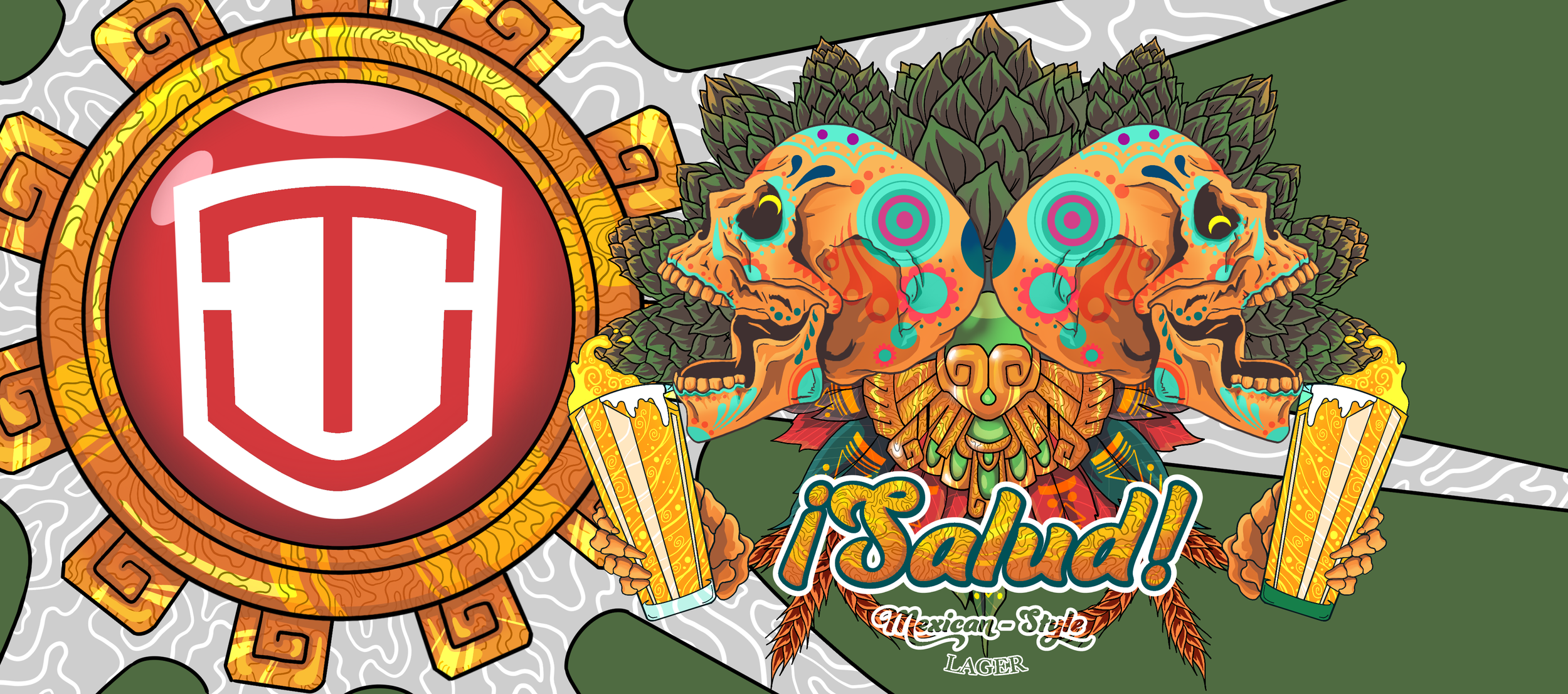
For this redesign I wanted to incorporate the Mexican culture into the design. I took inspiration from the Aztecs and the festive Dia de los Muertos (Day of the Dead) Holliday. I was able to create the golden bejeweled feathered piece by taking inspiration from the aztec traditional feathered head piece, and the golden patterned sun with the ruby centered piece, radiating in the background form the Aztec’s architecture. Taking reference from the Day of the Dead, I created the two ecstatic skulls with their vibrant colors, normally displayed and paraded on this day. As for the main colors that stick out the most, I reference the Mexican flag with their proud green, white, and red. A few hops behind the skulls, and a couple beers in the skeleton hands going in for the “Salud!’ or “Cheers! I was finally happy to call this design completed.
TRUE VINE BREWING COMPANY - HONEY, WHEAT SHRUNK THE KIDS
WHEAT BEER WITH TEXAS HONEY
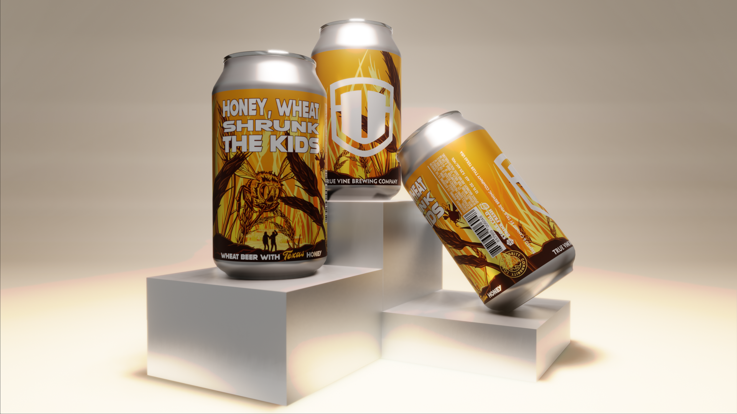

When I heard the name of this beer, I knew exactly the direction I wanted to go in. For this redesign, and I obviously had to take inspiration from the classic comedy movie “Honey, I shrunk the kids”. From the shrunken kids in the foreground, to the call back to the iconic bee scene. For this design I wanted to keep the traditional orange color from the original beer label design, but add more of an orange golden gradient to symbolize a sunrise and to strongly suggest to consumers that this in fact was a wheat beer with Texas honey. To further more play on the “wheat” side of the beer, I added towering wheat stocks in the background, middle ground, and foreground. Along with a honey comb and a wheat stock in the “O” of honey, and the “I” of kids, the beer label known as “Honey, Wheat Shrunk the Kids” was complete.
TRUE VINE BREWING COMPANY - ROSE CITY, IPA
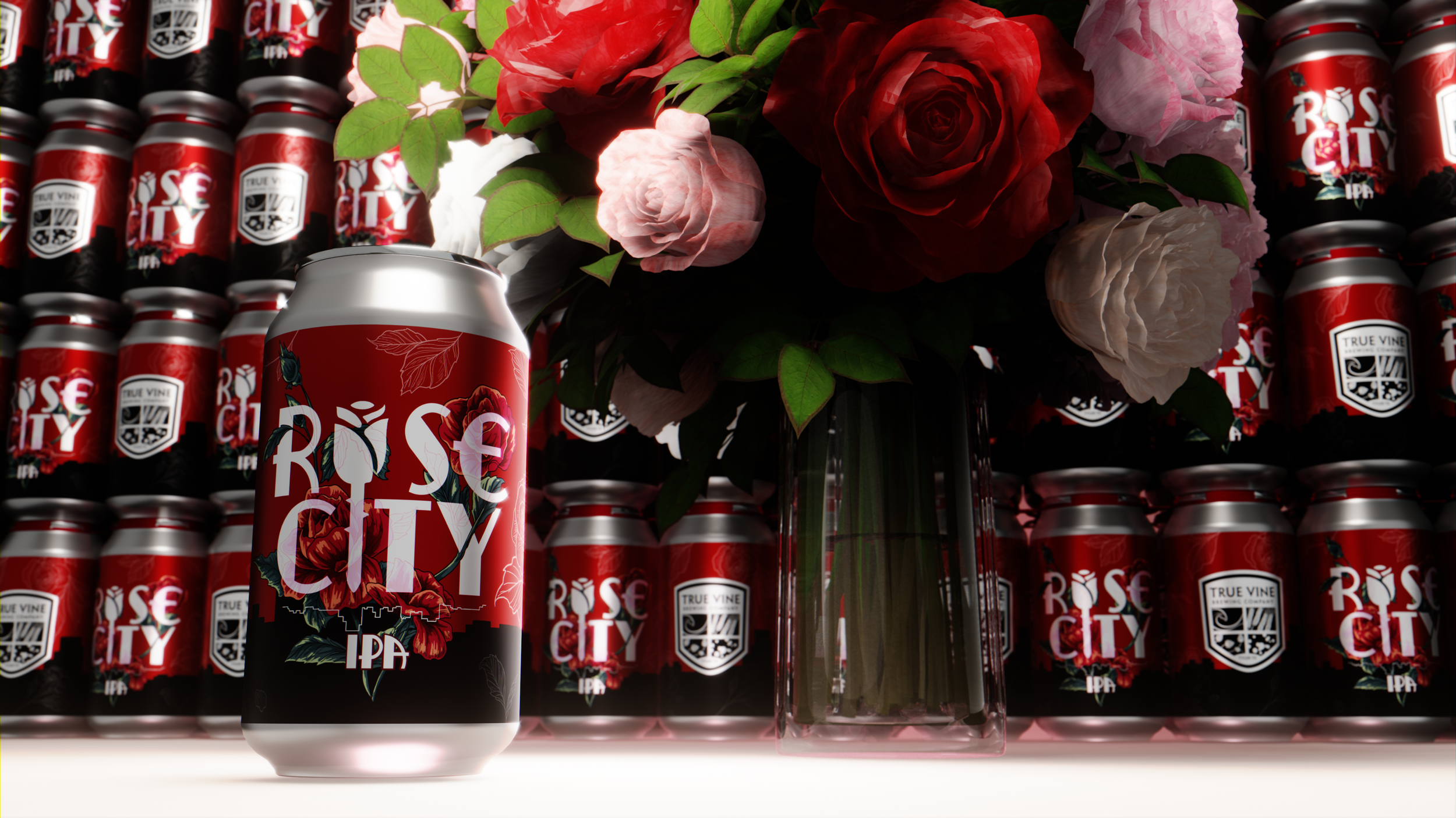

For the redesign of this label I kept the original red color, and the thorn rose in the name from the original design for a call back to the fans of this beer. I wanted to elaborate on the name “Rose City” by implementing roses, and the city of Tyler where this iconic beer was created. I started off with the main focal point, the name. I wanted to draw the eyes to it, so I came up with the idea to have the rose’s vines intertwined and have the illustration guide the eyes to the name. For the background, I thought the original solid red color caught the eyes of anyone scanning through the shelfs, but I believed it needed a little more. I decide to add a simple silhouette of the downtown city of Tyler, and some line art of roses scattered around with a low opacity, to give the background a small amount of flare. With a small inverted line art of Downtown Tyler underneath the word “city”, to separate the name from the style of beer, the new rose city label was born.